Tips & Tricks
Here is an assortment of design tips that I've learned and discovered over the course of my bitmap font journey that may help you on your own journey. Many of these tips apply not just to bited, but also to bitmap type design in general.
Tradeoffs between different font characteristics
The decisions you make when beginning to design your font play a large part in determining how your font eventually behaves, as well as the kinds of compromises you'll eventually have to make as you continue designing that font.
Proportional vs. Monospaced
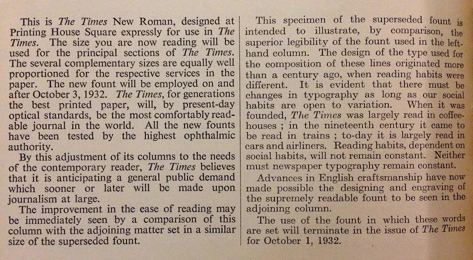
Proportional fonts are suitable for a variety of text use cases. The immediate benefit of making your font proportional is that you can fit the width to the glyph, as opposed to the glyph to the width. For example, you can easily make "m" wider than "x", and "x" wider than "i". This grants you more freedom in design choices, and makes it far easier to expand your font's Unicode support without having to compromise compactness.
Source: nypl.org
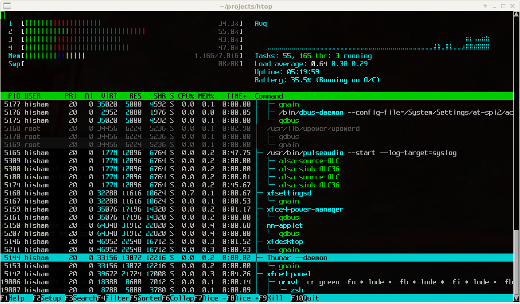
Monospaced fonts tend to be more niche than proportional fonts, and are primarily used in data-heavy contexts where having a fixed glyph width is important. Terminal emulators, for example, rely on the fixed width to properly display tabular data and render more complex UI elements. The design choices you can make with a monospaced font are inherently limited by its width constraint; going back to the previous example, you'd have to make "m", "x", and "i" the same width. A significant part of your design process will involve balancing aesthetics and legibility through compromises in compactness and spacing.
Source: htop.dev
The choice between proportional and monospaced is not entirely black-and-white, however. A proportional font may have monospaced digits for cleaner numerical formatting. Conversely, a monospaced font may have proportional widths in its less-used glyphs for the sake of legibility.
Size
The overall size of your font's bounding box directly affects how much detail you can pack into each glyph -- and indirectly, how much Unicode support you can have. For reference, GNU Unifont is 8x16 and 16x16, and features perhaps the most comprehensive Unicode support of any bitmap font. If you're looking to build a font specifically for HiDPI screens, then choosing a larger size will afford you much more flexibility to make readable fonts with great Unicode support while remaining reasonably compact.
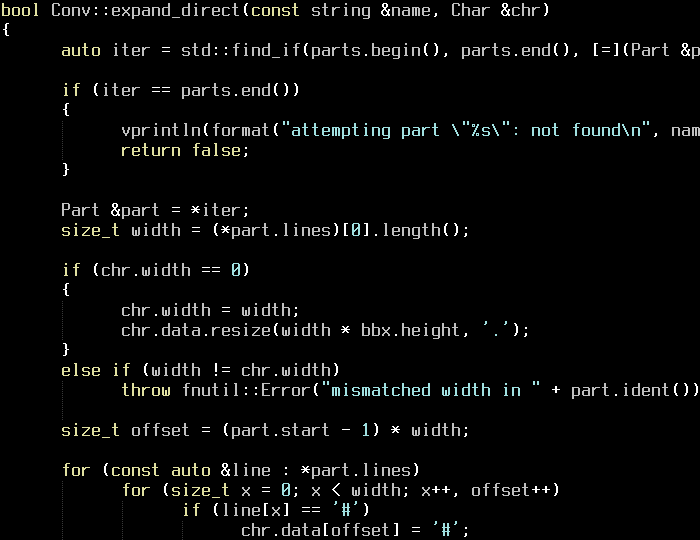
Terminus 10x20 Bold. The large size allows for bold variants and Unicode coverage, even in monospace.
There is a practical lower limit to the bounding box size. For example, with only 4px width for the glyph itself, letters like "m" and "w" become quite difficult to design around. But don't let this discourage you! nanofont3x4 manages to support the entirety of printable ASCII, and is about as readable as you can get at that tiny of a size.
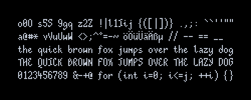
eldur 5x13. Note how the "m" and "w" glyphs are drawn to fit into a 4px width.
Width-to-Height Ratio
The effect of width-to-height ratio on your font can be a bit subtle. If you don't plan on supporting Unicode symbols blocks and box drawings in your font, then choosing this ratio is largely a matter of aesthetic preference. On the other hand, if you want your font to support these symbols, then here are a few considerations to keep in mind:
- Block elements (
U+2580..U+259F) are composed of 8ths. These are easiest to draw when your width/height are divisible by 8. - Box drawings (
U+2500..U+257F) have several types of lines:- Normal straight lines. These go through the center of the bounding box, and are easiest to draw when the lines can be visually centered. E.g. 1px lines go best with odd widths/heights.
- Bold straight lines. Same deal as their normal counterparts.
- Dashed variants of normal/bold straight lines. These tend to be subdivided in ways that are nightmarish to account for.
- Diagonal lines that go from corner to corner. Perfectly straight diagonal
lines are found at
1:norn:1ratios -- e.g. 8x8, 8x16.
Note
In this case, "easiest to draw" basically implies "looks the best".
With vector fonts, you can design these symbols as-is and pay a relatively small cost in rendered crispness. But with bitmap fonts, you will have to accept some tradeoffs in visual perfection no matter what dimensions you choose. Fortunately, our eyes are quite easy to fool!
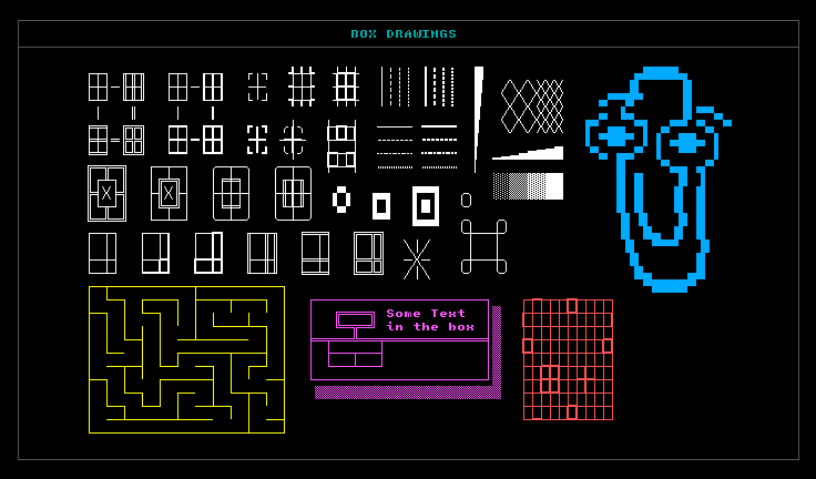
ANAKRON 8x12. If you look closely, you may be able to pick out tiny imperfections resulting from the tradeoffs I had to make.
x-height
When targeting readability at smaller sizes, it's pretty common practice for designers to increase the x-height of their font. Frankly though, I find that the choice of x-height is up to personal taste. For example, I personally am partial towards fonts with lower x-heights.
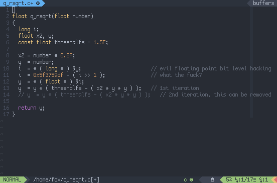
Cozette 6x13. Cozette's x-height isn't that high, but its uppercase letters are 1px shorter than the tallest lowercase letters. This makes it feel like a font with high x-height.