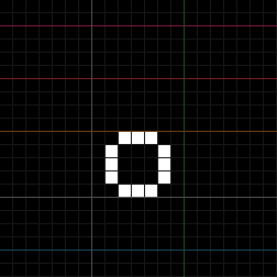
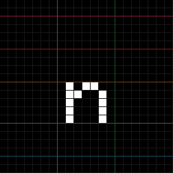
"adhesion"
When making fonts from scratch, it's pretty useful to have a starter word for feeling out the letterforms and defining a style. We'll use "adhesion" as our starter word.
Pen Tool
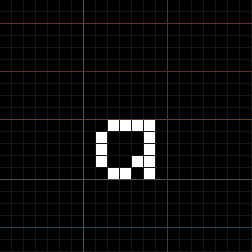
Double-click the cell for "a" to define it. The tool should be set to pen with default color mode (B+Q). Draw the following glyph:
Tip
The pen tool's default color mode is the same as first-cell mode (T). In this mode, the first pixel's color is inverted; as long as the pen is held down, that color persists when dragged. This allows you to both draw and erase without having to switch modes.
If you wish to only draw or erase, you can press W or E respectively to change the mode.
Copy/Paste
This "a" we've drawn could easily become a "d" with a bit of tweaking. With the "a" cell still selected in the table, copy it (Ctrl+C). Then single-click the "d" cell and paste (Ctrl+V).
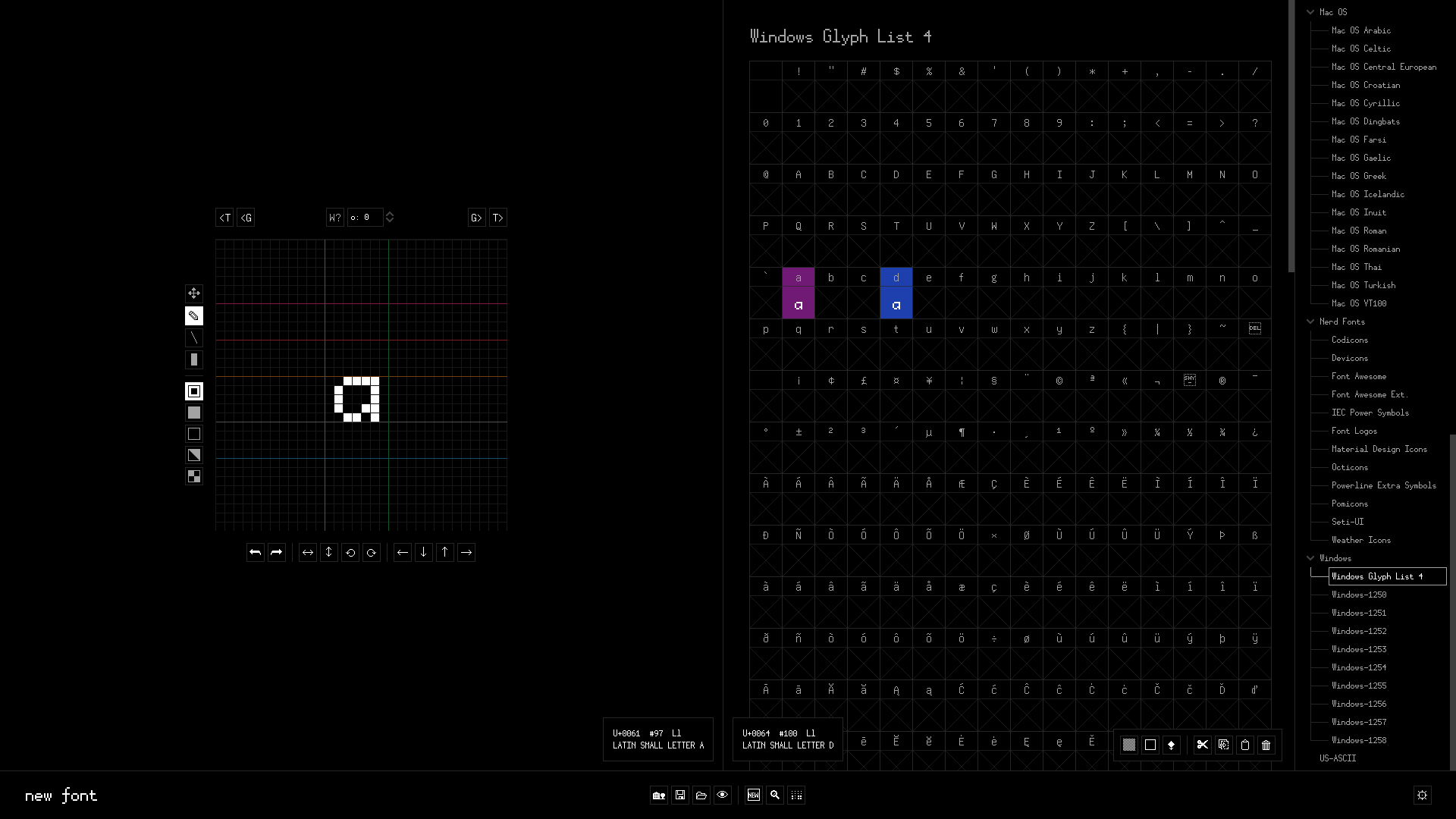
Clicking the "d" cell again will send it to the Editor. This will highlight the "d" cell in purple to indicate it is being edited.
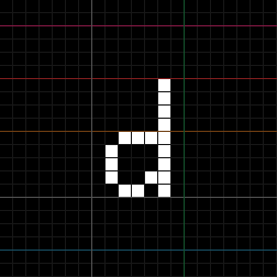
Here's the "d" glyph we'll draw:
Transforms
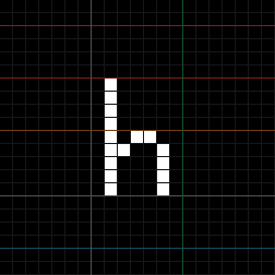
For "h", we can start by copying "d" and paste it into the "h" cell. We can then flip horizontally (Shift+H) and draw the following:
Note
The glyphs of our unicorn font so far have spacing on both sides, where flips
are symmetrical. However, if you're working with glyphs with spacing on only one
side, then you may need to translate the glyph left or right (Shift+Left /
Shift+Right) after flipping.
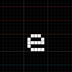
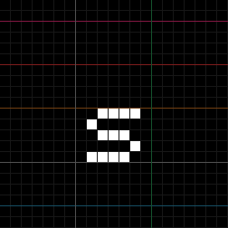
The glyphs for "e" and "s" should be pretty straightforward to draw:
DWidth
So far, all of our glyphs have had the same default dwidth, which means that -- up until now -- the font has been monospace. Monospace fonts are useful primarily in data/programming contexts like terminals, which typically expect consistent glyph widths. Most bitmap fonts tend to cater to these niches, and are typically monospace as a result.
However, bited also supports proportional fonts with variable dwidths. These can
be more flexible design-wise than monospace fonts. Let's make unicorn
variable!
While editing, you may have noticed these controls above the grid:
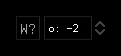
bited features two dwidth modes that can be toggled by pressing the W? button:
offset (indicated by o:)
The given input is treated as an offset of the default (font-wide) dwidth. Glyphs in offset mode will recalculate their dwidths when the default dwidth changes.
glyph_dwidth = font_dwidth + offset
By default, new glyphs are set to offset by 0.
dwidth (indicated by w:)
The given input is treated as the glyph's dwidth. Unlike in offset mode, glyphs in dwidth mode will not change their dwidths when the default dwidth changes.
Since "i" is a thinner letterform, we'll use an offset of -2:

The glyphs for "o" and "n" will also be pretty straightforward: