Anatomy of a Font
Tip
This section might be a bit dense, especially for newcomers. Feel free to just skim through on your first read, and then -- as you progress through subsequent sections -- periodically refer back here. The information here is important, but can also be intuitively learned through the hands-on process of making a font.
In bited, a font is a collection of glyphs which generally share some sort of style. Creating a font is essentially just creating a bunch of glyphs!
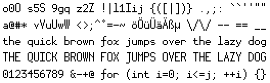
A glyph (sometimes used interchangeably with "character"/"char") is a visual representation of a symbol -- e.g. letters, numbers, punctuation. In bited, where we'll be working with Unicode bitmap fonts, glyphs represent Unicode symbols and are constructed from pixels.
Metrics
The glyph view inside the Editor exposes several metrics as colored grid lines:
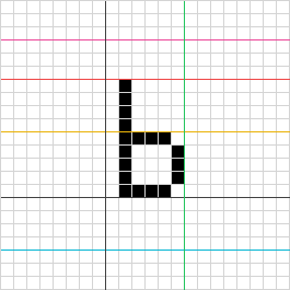
Horizontal Metrics (from left to right)
Baseline
The line upon which the other horizontal metrics are measured.
DWidth
Typically known as advance width. A glyph-specific metric for the amount of horizontal space this character occupies.
Vertical Metrics (from top to bottom)
Ascent
The topmost edge of the font. Pixels above the ascent will bleed upwards into the previous line.
Cap Height
The height above the baseline of a typical uppercase letter in your font.
This metric is purely for designer use; it isn't used in any font-related calculations.
X-Height
The height above the baseline of a lowercase "x" in your font.
This metric is purely for designer use; it isn't used in any font-related calculations.
Baseline
The line upon which the other vertical metrics are measured.
Descent
The bottommost edge of the font. Pixels below the descent will bleed downwards into the next line.
Typesetting glyphs relies on boxes formed from each glyph's ascent, descent, horizontal baseline, and dwidth. In other words:
- Given two consecutive glyphs, the next glyph's horizontal baseline and the previous glyph's dwidth will be equal.
- Given two consecutive lines of glyphs, the next line's ascent and the previous line's descent will be equal.
When choosing your bitmap font's metrics, you should make sure to reserve enough space so that glyphs don't crowd each other out.
Here are some other useful things to know about these metrics:
- Font size can be determined by adding the ascent and descent.
- Diacritics will typically go between the ascent and cap height or between the descent and vertical baseline. If you're planning on adding glyphs with diacritics, make sure to also reserve space for these.
- A glyph may extend beyond its box. This is especially common in small monospace fonts, where the designer might opt to trade spacing for visual clarity. Such a tradeoff is more acceptable for symbols that are more likely to appear on their own.
Sample Glyphs
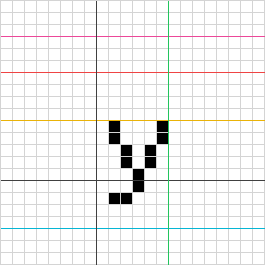
The tail in this "y" extends below the baseline, while the body remains above the baseline.
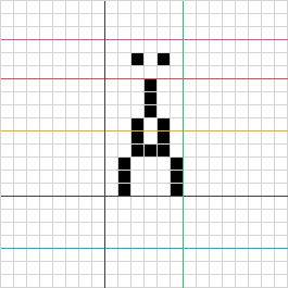
The diaresis in this "Ä" sit above the letter, between the ascent and cap height.
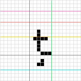
The cedilla in this "ţ" sits below the letter, between the descent and baseline.
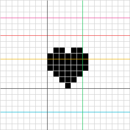
This "♥" extends a bit beyond its dwidth.